Tutorial #2: Two Toned icon
19 November 2023 06:00 pmAs requested by ![[personal profile]](https://www.dreamwidth.org/img/silk/identity/user.png) impala_chick in my Ask a Maker post, here's a tutorial for how I made a two-toned Mateo Chavez icon:
impala_chick in my Ask a Maker post, here's a tutorial for how I made a two-toned Mateo Chavez icon:
Going from to
to  .
.
Let's start with a bit of background information: This icon was made for![[community profile]](https://www.dreamwidth.org/img/silk/identity/community.png) dailyicons using the prompt "Two Toned". So, I knew from the get go that the result wouldn't contain any "regular" colouring. However, I still like to treat making icons - whether they are black & white, monochrome or two toned or whatever other limited colour scheme might be out there - like I would any other icon. At least most of the time. Courtesy of experience, I feel the most comfortable judging sharpness, brightness and contrast that way.
dailyicons using the prompt "Two Toned". So, I knew from the get go that the result wouldn't contain any "regular" colouring. However, I still like to treat making icons - whether they are black & white, monochrome or two toned or whatever other limited colour scheme might be out there - like I would any other icon. At least most of the time. Courtesy of experience, I feel the most comfortable judging sharpness, brightness and contrast that way.
This was made using Photoshop CS5 and, unless noted otherwise, layers are set to normal and 100% opacity. I used this website to translate the German terminology of Photoshop to English.
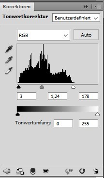
The first step was to try and light the image up. In this instance, I started with a Levels layer. I simply dragged the right marker for white to the point (178) where the level graph started. I did the same to the left marker for black (3) and the middle marker (1.24) until I was happy with the result.
In the end, this is how my levels setting looked like:
This worked nicely to lighten up the image:
to 
As I like pairing the levels layer with a curves layer, I did here as well. I usually just pick the white eyedropper (bottom of the three) and click outside of the image area to see what Photoshop does on it its own. If I'm not entirely satisfied with the result, I follow it up by trying to pick the brightest pixel and repeating the action with the black eyedropper (top of the three) and the darkest pixel. I'm bad at noting down when I don't go with just the first step of letting Photoshop do whatever it wants. However, I think in at least 90% of the cases that's all I do.
In any cases, it helped with reducing some of the yellowish/reddish tint as visible in the shirt, so I was happy enough.
My curves layer liked like this:

Resulting in the image going from to 
I didn't like how the bottom was so much brighter than the top, so I added a layer where I randomly drew some black (to darken the area) and white (to lighten the area) lines of various strength and following it up with a Gaussian Blur. I just use whatever I had it previously set to (and apparently don't note it down) and possibly applying it more than once.
The result without adjusting the layer settings just yet looked the following:
 &
& 
(first one is on top of the previous layers and the other with a red background to make it more visible for the purpose of this tutorial)
I then set the layer to Soft Light at 60% to blend it into the image to subtly alter the darkness/lightness of the areas I painted over:
to 
Even though the final colouring would be vastly different, I did want the saturation to be a bit brighter, so I increased it by +11 using a Hue/Saturation layer.
The Hue/Saturation Layer:

This took the icon from to  .
.
For the next two steps I created a condensed layer of all previous steps using the key combination Ctrl+Shift+Alt+e. It should create a new layer that has all of the other layers condensed into it without deleting the other layers. Depending on where the focus is in the application, I occasionally have all other layers deleted or a different dialog open. I have no idea why that is, but if that happens I undo the step and repeat it until it works as I expected it to.
I set the new layer to Soft Light at 40% before copying it and setting the copied layer to Screen 20%. The Soft Light setting tends to brightening and contrasting the colours a bit and the Screen layer lightens it up.
This takes the icon from to  and to
  .
.
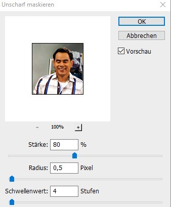
At this point I was happy enough with the brightness, contrast and so on. I created another condensed copy layer using Ctrl+Shift+Alt+e. I turned it into a Smart Filter layer (to retain and potentially readjust the filter settings) before applying an Unsharp Mask. When working with icons, I typically have the radius at 0.5 pixel and a threshold of 4. In this case I set the weight (?) to 80%.
The Unsharp Mask settings:
to 
At this point I did add another black&white layer to adjust the light and dark areas. Or well, going by how the layer looked, just black.
 &
& 
(first one is on top of the previous layers and the other with a red background to make it more visible for the purpose of this tutorial)
This helped to even out the grey in the background a bit more.
Going from to  .
.
Finally, I decided to play around with the gradient layer to actually turn it into a two-toned icon. To do that, I typically start out trying the presets. I'm not sure if I actually used the exact values of a preset or plaid around with it a bit to slightly adjust the colours, but I did like the yellow/purple combination a lot. The yellow end has the hex code #F9E600 and the purple is #6F156C
I did set it to reverse to automatically switch which colour is t 0% and which at 100% so it didn't look like a weird negative image.

This took the icon from to .
At this point I was apparently happy with the way it looked and stopped. :)
Here is the final layer overview:

I hope the tutorial isn't all over the place. Mentally, I've been a bit all over the place today and that can lead to a mix of run-on sentences and sudden change in topic.
Going from
to .Let's start with a bit of background information: This icon was made for
This was made using Photoshop CS5 and, unless noted otherwise, layers are set to normal and 100% opacity. I used this website to translate the German terminology of Photoshop to English.
The first step was to try and light the image up. In this instance, I started with a Levels layer. I simply dragged the right marker for white to the point (178) where the level graph started. I did the same to the left marker for black (3) and the middle marker (1.24) until I was happy with the result.
In the end, this is how my levels setting looked like:
This worked nicely to lighten up the image:
to As I like pairing the levels layer with a curves layer, I did here as well. I usually just pick the white eyedropper (bottom of the three) and click outside of the image area to see what Photoshop does on it its own. If I'm not entirely satisfied with the result, I follow it up by trying to pick the brightest pixel and repeating the action with the black eyedropper (top of the three) and the darkest pixel. I'm bad at noting down when I don't go with just the first step of letting Photoshop do whatever it wants. However, I think in at least 90% of the cases that's all I do.
In any cases, it helped with reducing some of the yellowish/reddish tint as visible in the shirt, so I was happy enough.
My curves layer liked like this:
Resulting in the image going from
to I didn't like how the bottom was so much brighter than the top, so I added a layer where I randomly drew some black (to darken the area) and white (to lighten the area) lines of various strength and following it up with a Gaussian Blur. I just use whatever I had it previously set to (and apparently don't note it down) and possibly applying it more than once.
The result without adjusting the layer settings just yet looked the following:
& (first one is on top of the previous layers and the other with a red background to make it more visible for the purpose of this tutorial)
I then set the layer to Soft Light at 60% to blend it into the image to subtly alter the darkness/lightness of the areas I painted over:
to Even though the final colouring would be vastly different, I did want the saturation to be a bit brighter, so I increased it by +11 using a Hue/Saturation layer.
The Hue/Saturation Layer:
This took the icon from
to .For the next two steps I created a condensed layer of all previous steps using the key combination Ctrl+Shift+Alt+e. It should create a new layer that has all of the other layers condensed into it without deleting the other layers. Depending on where the focus is in the application, I occasionally have all other layers deleted or a different dialog open. I have no idea why that is, but if that happens I undo the step and repeat it until it works as I expected it to.
I set the new layer to Soft Light at 40% before copying it and setting the copied layer to Screen 20%. The Soft Light setting tends to brightening and contrasting the colours a bit and the Screen layer lightens it up.
This takes the icon from
to and to .At this point I was happy enough with the brightness, contrast and so on. I created another condensed copy layer using Ctrl+Shift+Alt+e. I turned it into a Smart Filter layer (to retain and potentially readjust the filter settings) before applying an Unsharp Mask. When working with icons, I typically have the radius at 0.5 pixel and a threshold of 4. In this case I set the weight (?) to 80%.
The Unsharp Mask settings:
to At this point I did add another black&white layer to adjust the light and dark areas. Or well, going by how the layer looked, just black.
& (first one is on top of the previous layers and the other with a red background to make it more visible for the purpose of this tutorial)
This helped to even out the grey in the background a bit more.
Going from
to .Finally, I decided to play around with the gradient layer to actually turn it into a two-toned icon. To do that, I typically start out trying the presets. I'm not sure if I actually used the exact values of a preset or plaid around with it a bit to slightly adjust the colours, but I did like the yellow/purple combination a lot. The yellow end has the hex code #F9E600 and the purple is #6F156C
I did set it to reverse to automatically switch which colour is t 0% and which at 100% so it didn't look like a weird negative image.
This took the icon from
to .At this point I was apparently happy with the way it looked and stopped. :)
Here is the final layer overview:
I hope the tutorial isn't all over the place. Mentally, I've been a bit all over the place today and that can lead to a mix of run-on sentences and sudden change in topic.
no subject
Date: 21 November 2023 04:52 am (UTC)no subject
Date: 21 November 2023 05:44 pm (UTC)I'm not sure when I first thought of using a simple black & white layer like that or if I saw it in a tutorial - I just know that it's so satisfying to use to even out areas I'm not happy with! And using a gradient layer in that fashion is about the only way I know how to use it. I'm sure there are many other potential ways to use it.
It's been ages since I really looked at tutorials, but I remember learning a lot from them. Outside of that it's primarily taking the time and liberty to just play around with something. The latter can be the hardest - to remember to do it and not to get frustrated with.
no subject
Date: 26 November 2023 03:58 am (UTC)no subject
Date: 29 November 2023 04:57 pm (UTC)