Here are some tips and tricks I've come across, figured out or otherwise learned in the all the times I've been doing icons, the occasional larger graphics and photography. I've taken notes for at least two more posts: One with general stuff about editing an image in general and what tools I know about and another with different techniques I use to brighten an image. They need some more editing and probably some sample images...
A note about the images used in this post as examples:
All photographs were taken by me and are unedited outside of resizing (and adding some lines). All icons were made by me and while I adore some, I'm not as happy with others. Some are probably over a decade old. I'm unashamed to use them as examples.
#1 - Image Size
One of the hardest lessons I had to learn (and keep on learning) is that image size can make a big difference. More than once, I've picked an image, had a vision and absolutely hated it at 100x100 pixel. The same is true for printing pictures. Some simply lose the effect I love about it at smaller sizes. Smaller sizes are also easier to overload with other elements like text, textures and even combining images. In contrast, larger images might feel empty.
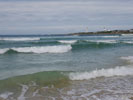
Here is an image at 1000x751 (click thumbnail for larger image) and 133x100 pixels. The lighthouse kind of disappears and it's hard to recognize the waves as waves.

#2 - Rule of Thirds
I'm not entirely sure when, where or how I first learned about this - university, icon making or researching tips and tricks for taking pictures with my camera. My gut is currently telling me icon making, so I'm going to go with that.
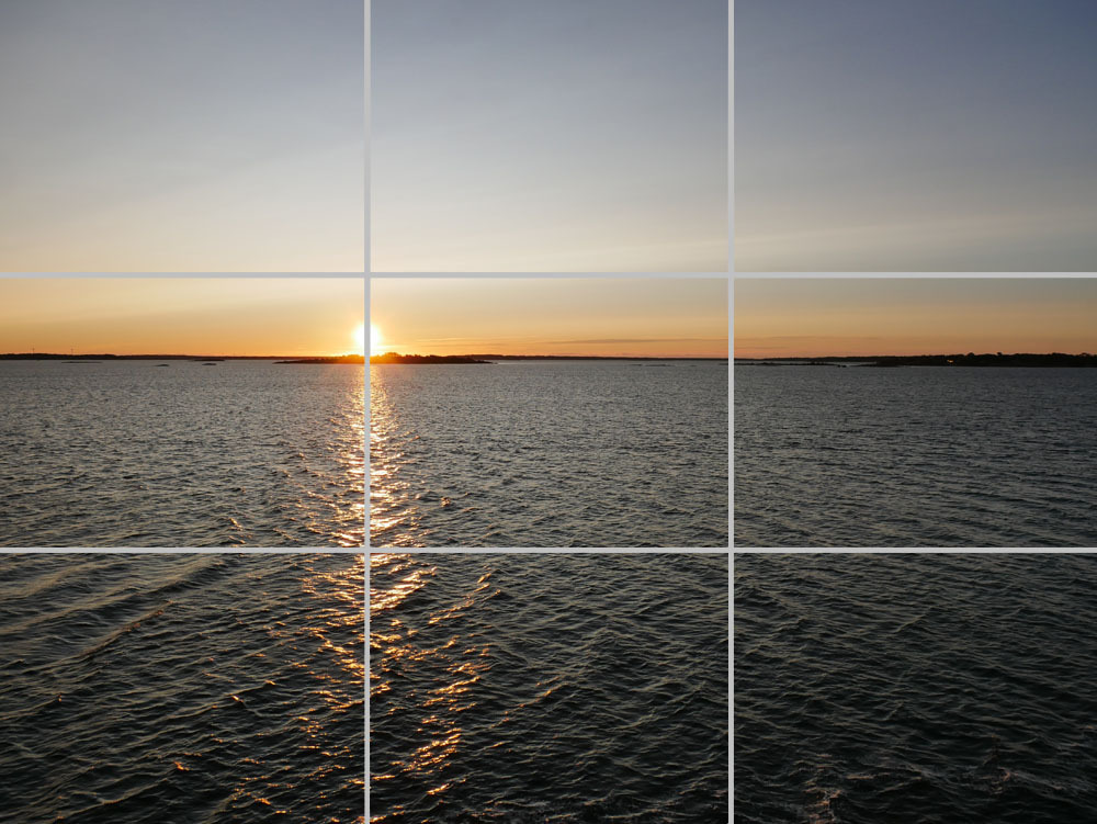
The rule of third divides an imagine into three equally sized rows and columns. My camera has an option to display the lines separating them and when cropping in photoshop I can also see them (although I don't remember if it's a setting or if it's doing that by default). It is something I like playing with - both when taking pictures (hello tons of similar pictures of the same objects/plants/landscapes/etc) and when I'm cropping down an image for icons.
The idea is to align the focus of an image with those lines dividing the image into thirds, especially the points where the horizontal and vertical lines cross. In all my experimentations so far, I've found that roughly sticking to those certainly does create images that I prefer over those when I don't adhere to it. I love using this for landscapes with visible horizons and multiple elements to put more of a focus on select elements.
The same is true when an image contains a lot of "negative space" i.e. space without focusable elements - like lots of water - in this instance, the focused element could take up on (or two) of the columns/rows instead of just being aligned to the thin line.
When it comes to people, I tend to center or line up against them on one of the lines or pick a body part (eyes, lips, etc).
Of course, variety is key and breaking things up a bit can refresh the mind. Some motives just beg for a full on, centered focus. And at other times it's enough to deviate from the usual division while still sticking to the thirds.
I think the most fun I had with this was when I did a tourist tour on a lake and I was taking a lot of pictures with the horizon line dividing the image into 2/3 sky and 1/3 lake. At one point I decided to actually switch it around to 2/3 lake and 1/3 sky and I loved the result - simply because it was (for me) something unusual.
When using levels in icons, I tend to go with two levels, with each level taking up the same amount of space. However, whenever I deviate from this - whether by giving one level more space or using three levels (typically with the center one level having more than a third of the available space) I tend to like the results a lot as well.
Read more on Wikipedia
Too further examplify this, I added lines on three photos I took close together on a trip last year:


#3 - Deviation from standard compositions
As I've already gotten into in point one - deviating from the standard compositions, especially when they have become your go to composition, can be quite freeing and inspiring. It allows you to try new perspectives, break up the monotony of always doing the same thing and gives fresh input. Even the usual compositions can look and feel more refreshing after having tried a different composition. The same goes for colourings, but I'm trying to focus on the image composition here.
#4 - Cutting elements out
Short answer: Don't ask me. Photoshop offers some tools and I never mastered them. The way I tend to "cut" something out is using layer masks and the mouse. Maybe a selection tool, but those always require some additional work with the mouse. I do have a bamboo tablet that I might use instead of the mouse which does make it a bit easier as it's just like using a pen on paper. It doesn't help in the sense that I'm not very good at drawing itself. It just feels a bit easier to control. It's also more than a decade old and I'm not sure what kind of improvements exist. Simpler edsges are easier to cut out and if all else fails, there's the option of covering shadows or bright edges by adding shadows or brightness from behind the cut out objects. Or making the edges intentional
Other tools are the freeform pen tool and the lasso tool if I'm not mistaken. I've made some notes on them in the document linked at the end of the post (lastr edited years and years ago). I never had the patience for them.
Some example icons for "blurry cut outs"

And a not so blurry one:

And some other attempts to cover issues up:


#5 - Combining Images
This can be a work of beauty or something extremly weird looking and the line between one and the other can be very small.
The easiest way is to work with levels. They can be vertical or horizontal, although I've primarily seen horizontal levels. You can do as many as you want, but the more you have the more critical image choice becomes as you will have less space per level.
My preferred choice is two horizontal layers with a 50% split between both, but you can use whatever percentage you prefer.
I primarily use it to show case an evolution, a motion, different angles for a scene or "gazes" between characters. Different angles are nice for people dancing, hugging, kissing or what have you.
The more complex versions might have an image in the background and another in the front - clearly distinguished or flowing together. The risk here is that the images flow together in such a way that neither one is clear enough to be recognized or cut each other off in unfortunate ways. If it works - I tend to be in awe. I just never managed it myself.
Some examples (some of which are very old):


#7 - Final Note
It's important to develop an eye and a sense of your personal style and preferences by looking at a lot of graphics with different compositions. Most everyone has a phone and can take pictures - go ahead and pick any random object to photograph (plants, pens, landscapes, people, whatever) and try to frame them in different ways using the same setup. Look at it from the top, from the side at an angle or even from the bottom depending on what it is and what's possible. There's no right or wrong way as long as you're happy with the result.
#7 - Resource Link
While I was in university (nearly 20 years ago), I had a couple of classes that dealt with editing media and included practical lessons using Photoshop. As I got hooked on it, I ended up lending a book about Photoshop 7 from the library and took extensive notes. I think at one point I did share a link as I found it in my google doc drive. The formatting is kind of weird and taking into consideration how long it's been since I last looked at the file, I won't fix it up. However, in case anyone is interested, feel free to check it out here.
I might or might not read this again tomorrow or in a couple of days and edit some wording. I've been procrastinating on this one since mid-January and just need to get it out.
I hope this was helpful to someone :)
A note about the images used in this post as examples:
All photographs were taken by me and are unedited outside of resizing (and adding some lines). All icons were made by me and while I adore some, I'm not as happy with others. Some are probably over a decade old. I'm unashamed to use them as examples.
#1 - Image Size
One of the hardest lessons I had to learn (and keep on learning) is that image size can make a big difference. More than once, I've picked an image, had a vision and absolutely hated it at 100x100 pixel. The same is true for printing pictures. Some simply lose the effect I love about it at smaller sizes. Smaller sizes are also easier to overload with other elements like text, textures and even combining images. In contrast, larger images might feel empty.
Here is an image at 1000x751 (click thumbnail for larger image) and 133x100 pixels. The lighthouse kind of disappears and it's hard to recognize the waves as waves.
#2 - Rule of Thirds
I'm not entirely sure when, where or how I first learned about this - university, icon making or researching tips and tricks for taking pictures with my camera. My gut is currently telling me icon making, so I'm going to go with that.
The rule of third divides an imagine into three equally sized rows and columns. My camera has an option to display the lines separating them and when cropping in photoshop I can also see them (although I don't remember if it's a setting or if it's doing that by default). It is something I like playing with - both when taking pictures (hello tons of similar pictures of the same objects/plants/landscapes/etc) and when I'm cropping down an image for icons.
The idea is to align the focus of an image with those lines dividing the image into thirds, especially the points where the horizontal and vertical lines cross. In all my experimentations so far, I've found that roughly sticking to those certainly does create images that I prefer over those when I don't adhere to it. I love using this for landscapes with visible horizons and multiple elements to put more of a focus on select elements.
The same is true when an image contains a lot of "negative space" i.e. space without focusable elements - like lots of water - in this instance, the focused element could take up on (or two) of the columns/rows instead of just being aligned to the thin line.
When it comes to people, I tend to center or line up against them on one of the lines or pick a body part (eyes, lips, etc).
Of course, variety is key and breaking things up a bit can refresh the mind. Some motives just beg for a full on, centered focus. And at other times it's enough to deviate from the usual division while still sticking to the thirds.
I think the most fun I had with this was when I did a tourist tour on a lake and I was taking a lot of pictures with the horizon line dividing the image into 2/3 sky and 1/3 lake. At one point I decided to actually switch it around to 2/3 lake and 1/3 sky and I loved the result - simply because it was (for me) something unusual.
When using levels in icons, I tend to go with two levels, with each level taking up the same amount of space. However, whenever I deviate from this - whether by giving one level more space or using three levels (typically with the center one level having more than a third of the available space) I tend to like the results a lot as well.
Read more on Wikipedia
Too further examplify this, I added lines on three photos I took close together on a trip last year:
#3 - Deviation from standard compositions
As I've already gotten into in point one - deviating from the standard compositions, especially when they have become your go to composition, can be quite freeing and inspiring. It allows you to try new perspectives, break up the monotony of always doing the same thing and gives fresh input. Even the usual compositions can look and feel more refreshing after having tried a different composition. The same goes for colourings, but I'm trying to focus on the image composition here.
#4 - Cutting elements out
Short answer: Don't ask me. Photoshop offers some tools and I never mastered them. The way I tend to "cut" something out is using layer masks and the mouse. Maybe a selection tool, but those always require some additional work with the mouse. I do have a bamboo tablet that I might use instead of the mouse which does make it a bit easier as it's just like using a pen on paper. It doesn't help in the sense that I'm not very good at drawing itself. It just feels a bit easier to control. It's also more than a decade old and I'm not sure what kind of improvements exist. Simpler edsges are easier to cut out and if all else fails, there's the option of covering shadows or bright edges by adding shadows or brightness from behind the cut out objects. Or making the edges intentional
Other tools are the freeform pen tool and the lasso tool if I'm not mistaken. I've made some notes on them in the document linked at the end of the post (lastr edited years and years ago). I never had the patience for them.
Some example icons for "blurry cut outs"
And a not so blurry one:
And some other attempts to cover issues up:
#5 - Combining Images
This can be a work of beauty or something extremly weird looking and the line between one and the other can be very small.
The easiest way is to work with levels. They can be vertical or horizontal, although I've primarily seen horizontal levels. You can do as many as you want, but the more you have the more critical image choice becomes as you will have less space per level.
My preferred choice is two horizontal layers with a 50% split between both, but you can use whatever percentage you prefer.
I primarily use it to show case an evolution, a motion, different angles for a scene or "gazes" between characters. Different angles are nice for people dancing, hugging, kissing or what have you.
The more complex versions might have an image in the background and another in the front - clearly distinguished or flowing together. The risk here is that the images flow together in such a way that neither one is clear enough to be recognized or cut each other off in unfortunate ways. If it works - I tend to be in awe. I just never managed it myself.
Some examples (some of which are very old):
#7 - Final Note
It's important to develop an eye and a sense of your personal style and preferences by looking at a lot of graphics with different compositions. Most everyone has a phone and can take pictures - go ahead and pick any random object to photograph (plants, pens, landscapes, people, whatever) and try to frame them in different ways using the same setup. Look at it from the top, from the side at an angle or even from the bottom depending on what it is and what's possible. There's no right or wrong way as long as you're happy with the result.
#7 - Resource Link
While I was in university (nearly 20 years ago), I had a couple of classes that dealt with editing media and included practical lessons using Photoshop. As I got hooked on it, I ended up lending a book about Photoshop 7 from the library and took extensive notes. I think at one point I did share a link as I found it in my google doc drive. The formatting is kind of weird and taking into consideration how long it's been since I last looked at the file, I won't fix it up. However, in case anyone is interested, feel free to check it out here.
I hope this was helpful to someone :)
no subject
Date: 18 February 2025 01:35 am (UTC)